Upper west Side
private Home
The ambition for this well-appointed new build was to give it some character. It had good bones, including herringbone floors and a solid Smallbone kitchen, and great views—panoramic, really—but lacked the personality of the owner’s country house in Washington, Connecticut.
Through a considered mixture of American mid-century furniture, chosen for its human proportions, and a strict, graphic color palette of neutrals and rust, a casual yet elegant home was created, one well suited to entertaining.
LOCATION
Upper West Side, New York City
SIZE
2,500 sf Three Bedroom Condo
SCOPE OF SERVICES
Programming, Space Plan, Interior Design, Furniture Design, Construction Management, Custom Millwork, Art Curation, Accessories, Styling
collaborations
Dean Fine Building
PHOTOGRAPHY
Joshua McHugh
Living room
Connected to both the kitchen and the dining room, the living room was designed entirely around entertaining. Without a television in sight, a playful placement of furniture (including classic Dunbar chairs and a Kagan-inspired sofa) was employed to maximize opportunities for conversation. The condo’s palette of camels, ivories, charcoals, and blacks accented by pops of rust, is exemplified here by the Noguchi floor lamp.
Kitchen
Fit for purpose, the condo’s original Smallbone kitchen was retained. To create continuity with the living room, it was painted black. The stools by Martell Woodworks while new, echo the mid-century pieces found in other areas.
Dining Room
The dining room extends refined palette and mixture of natural textures found in the living room. It also possesses the impressive views up and down Broadway. Situated on the 15th floor, it’s a lofty view, but one that still possesses a human scale, emphasized by the cozy drapery that frames both spaces.
Family room/Office
Set off the dining room, this room was originally conceived as an additional bedroom, which the owners didn’t need, so it was reconfigured into a family room stroke office. A darker palette complemented with sumptuous textures, as seen in the room’s walnut and suede-clad walls and its dark leather furnishings, make it a perfect space to work in or sink in with a good book. While newly installed pocket doors keep it connected to the other public spaces.
Foyer
Access to the condo is by an elevator that opens onto a foyer. Here, the original herringbone walnut floors can be seen, which formed the basis of the condo’s palette of warm neutrals. Darker accents, such as the black-painted elevator niche, and textures like the studded linen wallpaper on the ceiling, give a grand feeling to this transitional space.
Powder room
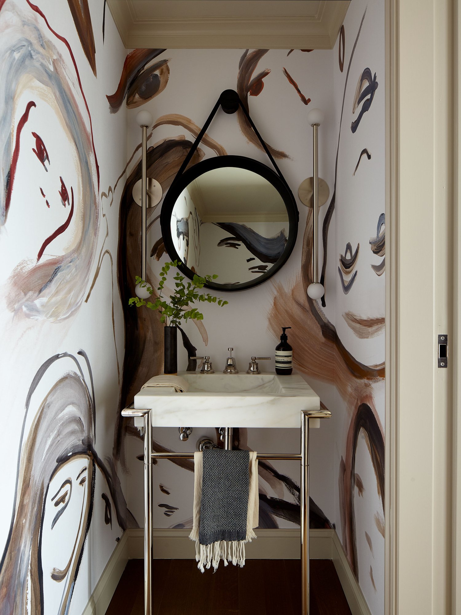
The powder room makes use of the figurative ‘Muse’ by the Brooklyn-based Calico wallpaper. While a complete contrast to the condo’s pared-back, graphic aesthetic, the custom-made paper felt appropriate for this small space.
guest bedroom
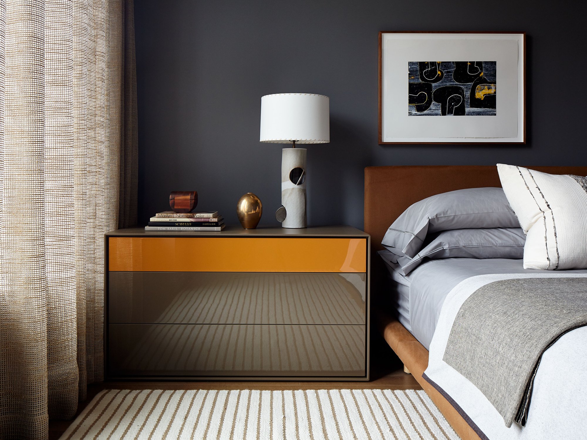
The guest bedroom was intended for just that, guests—particularly those who only make short stays. Thus, the approach to the space was casual, eschewing a formal closet, and opting instead for a coat rack to hang a few items. Color-wise, a darker palette dominates, complemented by the rich tones of a lacquered Italian cabinet and rust leather stools.
Main bedroom
A modest, linear room with very high ceilings, the main bedroom felt ungrounded at first. To bring things back to scale, the ceiling was painted one-third of the way down in a Kaufman-esque tan and a modern, four-poster bed was installed. Tactile textures, such as an ink-colored wool-shag rug and gauze linen drapery, complete the look. In the dressing closet, custom millwork was undertaken to increase storage space.


